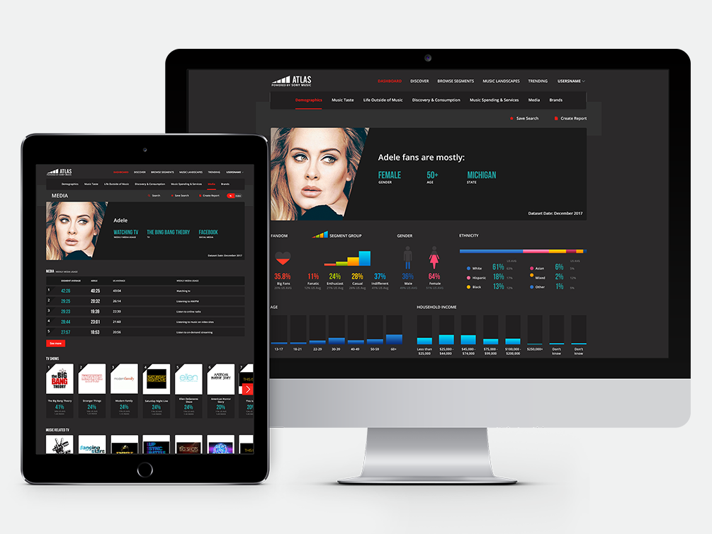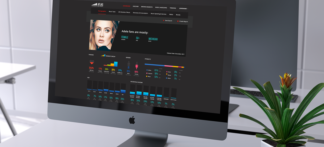
Product
Data Visualitation Tool
Role
UX/UI Designer
Skills
UX, UI, Prototype
Sony has collected very valuable information about the tastes of its consumers, this information allows them to detect trends and opportunities for their artists, but the current application is difficult to use and is not very intuitive.

This tool is for exclusive internal use, basically just Sony executives.

My role was UX/UI design, I was part of a small remote team that included a project manager. We had regular scrum meetings with the Sony Marketing Team and with the developers team.

Since the beginning we were told the scope of the project was just to change how to present the information to the users, the architecture of the app couldn’t change.
Our first task was to find what products are already on the market that offers something similar to Tripwing, we found a couple but these were a bit more limited with the offer of the tours or really going to the luxury market.
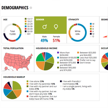

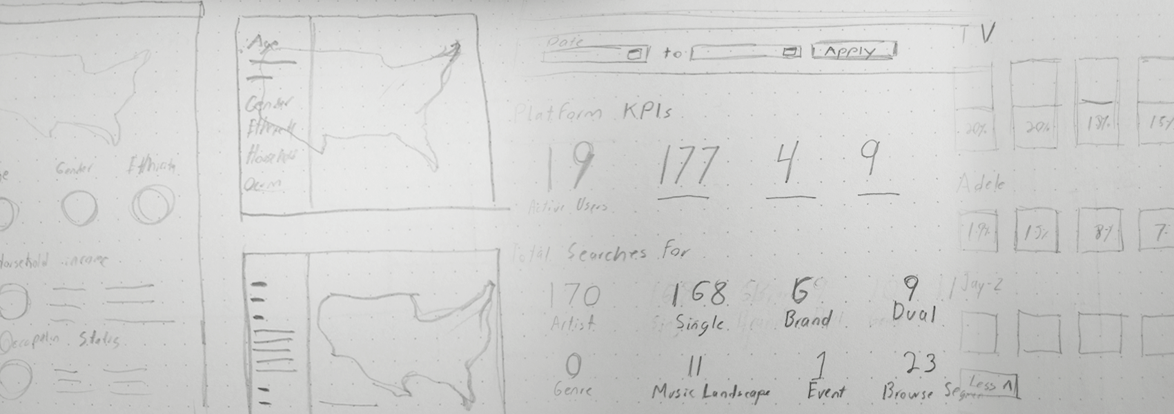
We did some quick sketching for some sections, and based on our initial research on data vizualitation we tried to give more importance to the map but on this step we find the map wasn’t working as we wanted and we moved from this idea to try somehting easier to read.
Since our first meeting we noted how important the color selection was for our client so we decided to skip the wireframes and work on the UI so we can show our ideas for the design and also test color palettes.

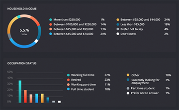
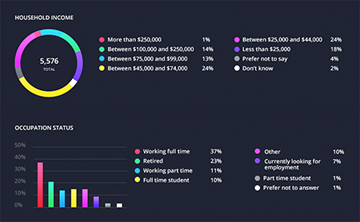
One requirement that came later on the project was to have dark and light themes but some way use the same colors for the graphics so we find a palette that could work on both.
We couldn’t get new data but we talked with the developers about a new feature that help the users to find the most relevant data from each search easily, this is how we added the discover section to the search results.
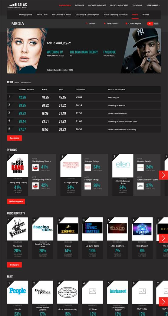
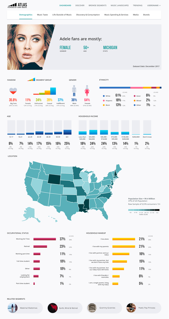
We did several prototypes on invision to show to the client and to the developers how a complete flow or an interaction could work. These prototypes are really valuable because allow us to explain each part of a process and find flaws or oportunities for improvement.
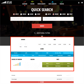
To make the search process easier we added tabs so the user doesn't see a field he don't plan to use.
Combined results contain a lot of data, using detail modal allow the users to see the most relevant information at first glance and see more in deep information only in the categories they are more interested.
Using horizontal scrolling let us see music taste top results first.
The client was really satisfied with our final product, now they are able to make research in a more approachable way.
Is not easy to work with a product were you can't make changes to the backend but we learned that even in that situations you can bring something new to the experience.
